
How to Choose the Right Color Palette for Your Website Design
In the world of website design, first impressions are everything. And one of the most powerful tools at your disposal to make a lasting impression is color. The right color palette can evoke emotions, create a sense of unity, and ultimately enhance the overall user experience. But with so many colors to choose from, how do you know which ones are right for your website? That’s where we come in.
So, whether you’re a seasoned designer or just starting out, read on to discover how to harness the power of color and make your website stand out from the crowd.
Table of Contents
The Importance of Color in Website Design
Color plays a crucial role in website design. It has the power to convey meaning, elicit emotions, and create a memorable user experience. When users visit your website, the colors you choose will be one of the first things they notice. The right color palette can instantly capture their attention and make them feel a certain way about your brand or business. On the other hand, a poorly chosen color palette can confuse or even repel users. That’s why it’s essential to understand the impact of color and how it can influence user behavior.
Color can affect how users perceive your brand’s personality and values. For example, warm colors like red and orange can evoke feelings of excitement and energy, while cool colors like blue and green can create a sense of calm and trust. By strategically using colors that align with your brand’s identity, you can effectively communicate your message and connect with your target audience on a deeper level.
Not only does color influence emotions and perceptions, but it also helps with usability and navigation. By using a well-designed color palette, you can guide users through your website, highlight important elements, and create a visual hierarchy that improves the overall user experience. Color can also be used to differentiate between different sections or functionalities, making it easier for users to understand and interact with your website.
Understanding Color Theory
Before diving into the process of choosing a color palette, it’s important to have a basic understanding of color theory. Color theory is the study of how colors interact with each other, how they can be combined, and how they can be used to create different effects. By understanding color theory, you’ll be able to make informed decisions when selecting colors for your website design.
The color wheel is a fundamental tool in color theory. It consists of primary colors (red, blue, and yellow), secondary colors (orange, green, and purple), and tertiary colors (red-orange, yellow-orange, yellow-green, etc.). These colors can be combined in various ways to create different color schemes.
One popular color scheme is the complementary color scheme, which involves using colors that are opposite each other on the color wheel. For example, pairing blue with orange or red with green. Complementary colors create a high contrast and can be used to draw attention to specific elements on your website.
Another color scheme is the analogous color scheme, which involves using colors that are adjacent to each other on the color wheel. This creates a harmonious and unified look. For example, combining shades of blue and green or yellow and orange.
There are also monochromatic color schemes, which involve using different shades, tints, and tones of a single color. This creates a clean and minimalist aesthetic. For example, using various shades of blue or different tones of gray.
Understanding these basic color schemes will help you create a visually appealing and cohesive color palette for your website.
Different Types of Color Palettes
Now that you have a grasp of color theory, let’s explore different types of color palettes that you can consider for your website design. Each type of color palette has its own unique characteristics and can evoke different emotions and moods.
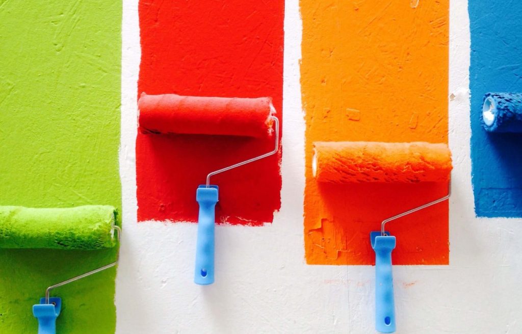
1. Warm Color Palettes: Warm color palettes consist of colors like red, orange, and yellow. These colors are associated with energy, excitement, and warmth. They can be used to create a vibrant and stimulating website design. Warm color palettes are often used for websites that want to convey a sense of urgency or create a bold and attention-grabbing look.
2. Cool Color Palettes: Cool color palettes consist of colors like blue, green, and purple. These colors are associated with calmness, trust, and relaxation. They can be used to create a soothing and peaceful website design. Cool color palettes are often used for websites that want to create a sense of serenity or convey a professional and trustworthy image.
3. Neutral Color Palettes: Neutral color palettes consist of colors like white, gray, and beige. These colors are versatile and can be used as a base for any website design. They create a clean and minimalist look and allow other colors to stand out. Neutral color palettes are often used for websites that want to convey a sense of sophistication or create a modern and timeless aesthetic.
4. Bold Color Palettes: Bold color palettes consist of vibrant and saturated colors. These colors make a strong impact and can create a memorable and eye-catching website design. Bold color palettes are often used for websites that want to stand out from the competition or target a younger and more adventurous audience.
5. Pastel Color Palettes: Pastel color palettes consist of soft and muted colors. These colors create a gentle and delicate look and can evoke a sense of nostalgia or sweetness. Pastel color palettes are often used for websites that want to create a feminine and elegant aesthetic or target a younger and more romantic audience.
How to Choose the Right Color Palette for Your Brand
Choosing the right color palette for your brand involves considering various factors, including your brand’s identity, target audience, and industry. Here are some steps you can follow to ensure you select the perfect color palette for your website design.
1. Considering Your Brand’s Identity
Your brand’s identity plays a crucial role in determining the right color palette for your website. Start by understanding your brand’s values, personality, and target audience. Are you a fun and playful brand or a serious and professional one? Do you want to create a sense of luxury and sophistication or a sense of adventure and excitement? Answering these questions will help you narrow down the color options that align with your brand’s identity.
2. Researching Your Industry
Researching your industry can provide valuable insights into the color palettes commonly used by your competitors or other successful brands in your niche. While you don’t want to copy their color schemes, analyzing their choices can help you understand what works and what doesn’t in your industry. It can also inspire you to think creatively and come up with a unique color palette that sets you apart from the competition.
3. Considering Your Target Audience
Your target audience is another crucial factor to consider when choosing a color palette. Different colors evoke different emotions and have different cultural associations. For example, red may symbolize love and passion in one culture but represent danger or warning in another. Understanding your target audience’s preferences and cultural backgrounds will help you select colors that resonate with them and create a positive user experience.
4. Using Color Psychology in Web Design
Color psychology is the study of how colors can influence human behavior and emotions. By leveraging color psychology in your web design, you can create a website that not only looks visually appealing but also elicits the desired response from your users. Here are some common associations and emotions associated with different colors:
– Red: Excitement, energy, passion
– Orange: Creativity, enthusiasm, warmth
– Yellow: Happiness, optimism, friendliness
– Green: Nature, freshness, growth
– Blue: Trust, calmness, reliability
– Purple: Royalty, luxury, creativity
– Pink: Romance, femininity, sweetness
– Brown: Reliability, stability, earthiness
– Black: Sophistication, elegance, mystery
– White: Purity, simplicity, cleanliness
– Gray: Neutrality, balance, professionalism
By understanding the psychological effects of different colors, you can strategically incorporate them into your website design to create the desired user experience.
5. Tips for Creating a Harmonious Color Palette
Creating a harmonious color palette involves selecting colors that work well together and create a unified look. Here are some tips to help you create a visually appealing and cohesive color palette:
– Start with a Base Color: Choose a base color that represents your brand’s identity and values. This will serve as the foundation for your color palette.
– Consider Color Contrast: Use colors that have sufficient contrast to ensure readability and accessibility. For example, pairing light text with a dark background or vice versa.
– Limit the Number of Colors: Avoid using too many colors in your palette, as it can overwhelm users and create a chaotic look. Stick to a maximum of 3-5 colors.
– Experiment with Shades, Tints, and Tones: Instead of using only one shade of each color, experiment with different variations to create depth and visual interest.
– Test for Accessibility: Ensure that your color palette meets accessibility standards, such as providing sufficient color contrast for users with visual impairments.
– Consider Color Trends: While it’s important to create a timeless design, staying up-to-date with color trends can help your website feel modern and fresh.
Tools for Selecting and Creating Color Palettes
Choosing the perfect color palette for your website design can be challenging, but luckily, there are several tools available to help you. These tools can assist you in selecting, creating, and refining your color palette. Here are some popular color palette tools:
1. Adobe Color: Adobe Color allows you to explore different color schemes, create custom palettes, and extract colors from images. It also provides access to thousands of color palettes created by other designers, making it a valuable resource for inspiration.
2. Coolors: Coolors is a color palette generator that provides random color schemes with a single click. You can customize and save your favorite palettes, export them in various formats, and even explore popular color schemes created by the Coolors community.
3. Color Hunt: Color Hunt is a curated collection of beautiful color palettes created by designers. It offers a wide range of palettes to choose from, each with its own unique style and mood. You can browse the palettes by popularity, color, or keyword.
4. Paletton: Paletton is a color scheme designer that allows you to create and fine-tune your color palette. It provides various tools and features to help you experiment with different color combinations, including the ability to preview your palette in different color models.
5. ColorSpace: ColorSpace is an online color palette tool that generates color schemes based on your selected base color. It provides different color harmony rules, such as complementary, analogous, and triadic, and allows you to customize and save your palettes.
These tools can save you time and effort when selecting and creating your color palette. Experiment with different options, explore the possibilities, and find the perfect combination of colors that represents your brand and captivates your audience.
Implementing Your Chosen Color Palette on your Website
Once you’ve chosen your color palette, it’s time to implement it in your website design. Here are some key areas where you can apply your color palette:
– Logo and Branding: Use your primary colors in your logo and branding elements to create a cohesive and recognizable brand identity.
– Typography: Select fonts and font colors that complement your color palette and ensure readability across different devices and screen sizes.
– Background and Layout: Apply your base color or neutral colors to the background and layout elements to create a consistent and visually pleasing design.
– Buttons and Call-to-Actions: Use contrasting colors for buttons and call-to-actions to make them stand out and encourage user interaction.
– Icons and Illustrations: Apply your secondary colors to icons and illustrations to create visual interest and reinforce your brand’s identity.
– Links and Navigation: Use your accent colors to highlight links and navigation elements, making it easier for users to navigate your website.
Testing and Adjusting Your Color Palette
Once you’ve implemented your color palette, it’s important to test it and gather feedback from users. Pay attention to how users interact with your website and how they perceive your brand based on the colors you’ve chosen. If necessary, make adjustments to your color palette to improve the user experience and align with your brand’s objectives.
A/B testing can be a useful technique to compare different variations of your color palette and determine which one performs better in terms of user engagement, conversion rates, and overall satisfaction. Experiment with different color combinations, contrast levels, and placement to optimize your color palette for maximum impact.
Remember that a color palette is not set in stone. As your brand evolves and your target audience changes, you may need to revisit and update your color palette to stay relevant and effective.
Examples of Effective Color Palettes in Website Design
To inspire you further, here are some examples of websites that have effectively used color palettes to create visually stunning and impactful designs:
1. Spotify: Spotify uses a combination of vibrant green and contrasting shades of black and white to create a modern and energetic look. The green color represents their brand’s identity and is used strategically to highlight important elements and create a sense of excitement.
2. Airbnb: Airbnb’s color palette consists of warm and inviting colors like red, orange, and yellow. These colors evoke a sense of adventure, warmth, and comfort, aligning with their brand’s values. The color palette is applied consistently throughout their website, creating a cohesive and memorable user experience.
3. Apple: Apple’s color palette is known for its minimalist and clean aesthetic. They use a combination of white, black, and shades of gray to create a timeless and sophisticated look. By keeping their color palette simple, Apple puts the focus on their products and allows them to shine.
4. Nike: Nike’s color palette is bold
Make your website stand out with colour
There are tons of colour best practices out there, and many places to do it. While it can seem intimidating, just think of it as a long-term experiment.
Pick out the tactics that seem most impactful in the least amount of time, and go from there. If you approach it with an open-minded, persistent, and data-first mindset, you’ll absolutely stand out.